Wikipedia SERP redesign contest Part 3: Conclusion
The contest ended about 2 weeks ago and here are my final designs. I am going to go over the lessons and subtle design tricks I learned during this process. The key points I will discuss are text colors, interaction design, and why I designed or chose certain ways to layout content. Let’s start by going over the typography and text color. TL;DR Final Design Pics: Part 1 Part 2 Part 3
Old Redesign:

New Redesign:
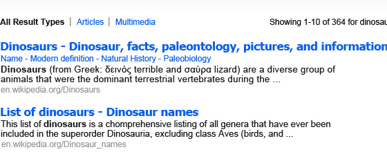
Here you see both the final version and initial version of the text color and layout I chose. You’ll notice that the top image does not use underlined text and appears more vibrant. There are a couple of things going on here. First brighter blue text, this made the search results look less dull and boring. Second bigger font and Georgia rather than pure Arial. If you ever find yourself having a hard time differentiating 2 pieces of text try messing with the type font. Georgia as a header followed by Arial body text looks really nice. Lastly, probably the least noticeable is the gray en.wikipedia.org text at the bottom. Since every article on this SERP (Search engine results page) leads to an internal wikipedia article, the only purpose that gray text serves is to assure the reader that they are staying on wikipedia. Since most SERP like Google, or Bing lead to external sites, you normally see them using these links in green.
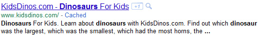
Using gray for en.wikipedia.org gives it less visual weight and doesn’t take away from the more important content on the site.
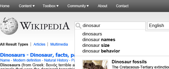
There were 2 key dynamic interactions that were designed in hopes of improving content discovery. The first was the standard auto complete upon searching but it includes a little twist.

The top half acts the same way an ordinary google search would. As you type in the search bar the auto completer starts listing the most common searched phrases. The second half lists the most popular articles based on the search. If any of the pictures/titles catch the users eye they can dive right into the content. If that wasn’t quite the information they were looking for, they can go through the regular SERP process.
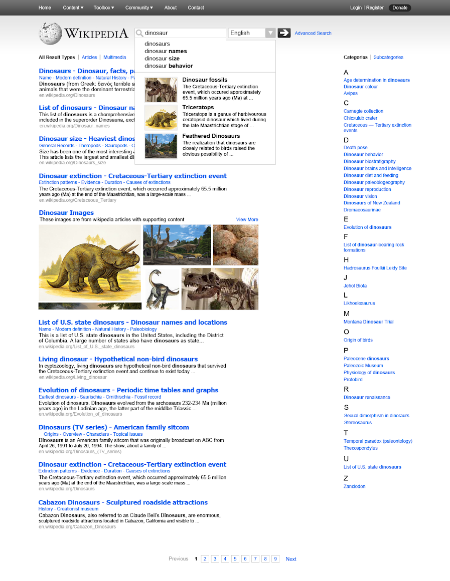
The second dynamic interaction occurs while browsing images on the SERP. When the user hovers over an image, it overlays its neighbor images, giving the user a better view on what it may be and enticing them to click.
Before hover:
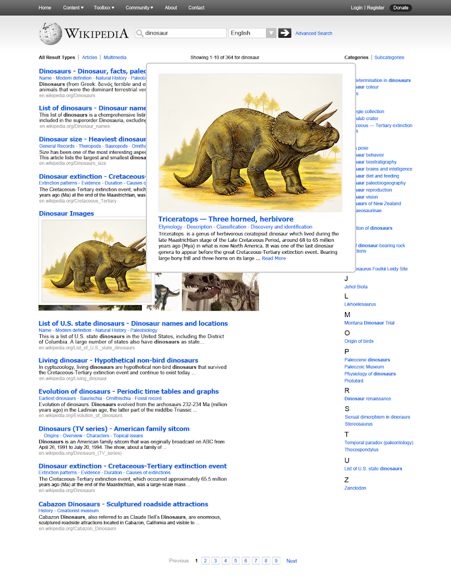
After hover:

Once the user clicks the hovered image, rather than taking them directly to an article, a large version of the picture with accompanying leading article text will appear.

If the user wanted to disable this effect/get rid of the picture all they would have to do is ‘hover out’ from either the large or smaller image. Another way this could be done is using the classic modal window layout, where everything is grayed out in the background, forcing the user to focus only on that article. The reason I chose the ‘hover out’ to disable idea is because I am hoping the user will explore more content as quickly and seamlessly as possible due to how quickly they can enter and leave a clicked photo.
Finally, heres a link to the final result. Two parts of the layout that I did not mention will be easier to understand when looking at the overall design.
The first part is the ‘Results Filter.’ It was designed so that users could browse content by both articles and (potential) Multimedia. These would be things like images, audio, and video. I believe those forms of content inevitably will play a larger role on an internet based encyclopedia. So this filter mechanism would allow the user to easily browse through more engaging multimedia or stick with the more academic article approach.
The second part is the categories and subcategories section. This is something I found hidden deep within Wikipedia, as I navigated the site. The purpose of it is to serve as further content discovery. It lists articles and sections that can be very quickly scanned, exposing the user to topics they might not have known existed.
Overall the redesign helps improve content discovery. Design wise it is not far from normal SERPs. For the contest this is both positive and negative. Usability wise, users who are accustomed to regular SERPs, will have an easy time adjusting to this page. The bad part is it doesn’t have the ‘radically different redesign’ factor. I’ll definitely take usability over that anyday.